




Secret Scanning extended metadata & multipart validation
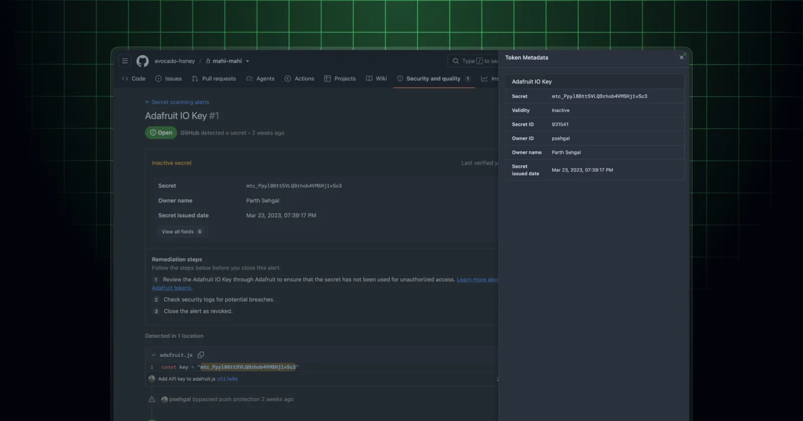
Leaked-secret alerts needed room for 30+ metadata fields without turning into a mess. I designed and built the whole experience - an in-content metadata table plus a sidesheet drawer for the long tail.
What happened
On July 7, 2026, GitHub announced the general availability of Secret Scanning extended metadata and multipart validation - richer context on leaked secrets, along with validators that can verify multipart credentials.
Under the hood, "extended metadata" means a lot of new fields on a single alert: things like the secret's owner, when it was created and when it expires, the project and org context it belongs to, and the details behind multipart validation. On some alerts that's 30+ fields - and that scale was exactly the problem I set out to solve.
The problem
All of that metadata used to live in a table crammed into the right-side metadata sidebar. That worked when there were a handful of fields. It falls apart the moment you try to add dozens: the sidebar balloons, the important details get buried next to the trivial ones, and the whole alert view starts to feel bloated and janky. It's just not a scalable place to keep piling things.
There was a subtler, deeper problem hiding underneath it too. Some alert metadata shows up in the body of the alert, and other fields show up in the sidebar - with no clear design pattern for when a given field should go where. So on top of "where do we put 30 more fields," we didn't even have a principled answer for where metadata belongs in the first place.
Where I fit in
This is design engineering owning a problem end-to-end. Rather than guessing at a layout, I prototyped several directions in code so we could actually feel how each one held up as the field count grew - which ones stayed readable, which ones collapsed under their own weight.
The solution I shipped solves all of it:
- A standard in-content metadata table - a top-level table that surfaces the high-priority, alert-specific metadata front and center, in the body of the alert where the most important context should live.
- A "view more" sidesheet drawer - the ever-growing, exhaustive list of fields gets tucked into a sidesheet drawer that opens on demand. The long tail is one click away when you need it, and completely out of the way when you don't.
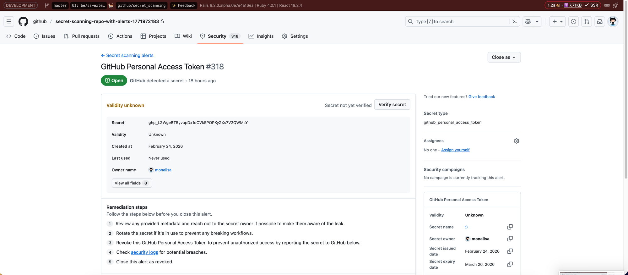
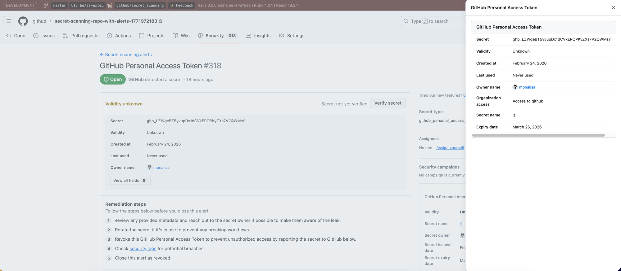
That split does two things at once: it gives the important metadata a proper home in the content, and it gives the exhaustive metadata somewhere to grow without stuffing it into the main view or overflowing the sidebar. And because the in-content table is a reusable pattern, it also starts to answer that deeper question of where metadata should go - not per-alert guesswork, but a consistent place for the fields that matter most.
This builds on some earlier metadata work I did back in February, but this July milestone is the fuller, more complete version of the experience - the in-content table and the sidesheet drawer together.