Rebranding @ Charter Healthcare
A campaign to rebrand, redesign, and rebuild Charter's digital identity
✍🏽 About Charter Healthcare
Charter Healthcare is a healthcare company devoted to helping patients navigate their post-acute care journey. They’re big in Southern California, providing services like home health, hospice, palliative care, and more.
⚠️ The Problems
- Charter had an extremely outdated brand, and wanted to freshen up their identity.
- They also wanted to expand their online presence and lean into more modern online business approaches to marketing and technology.
✨ The Solutions
- Recreate the company logo and brand identity
- Translate the new brand identity into a design language and a design system
- Create a new corporate marketing website and other digital and physical products to embody the new brand and show it off to the world
👯♂️ The Team
Executive Team
- CEO
- COO
- CFO
Marketing Team
- VP of Brand/Marketing
- Director of Marketing
Technology Team
- VP of Technology
- Creative Lead, Designer, Developer (Me 👋🏽)
🎨 Logo Redesign
An Outdated Logo
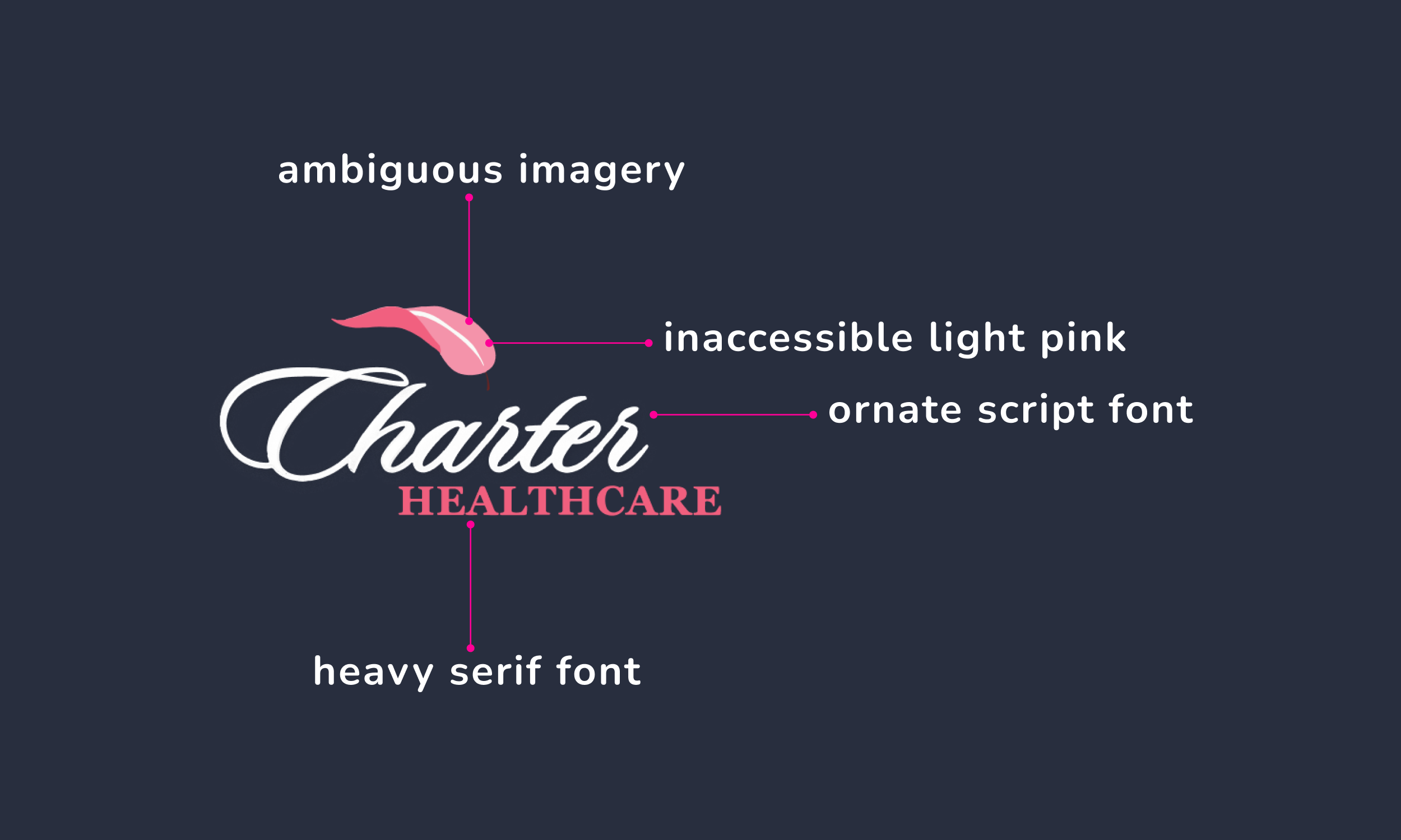
The existing logo had some dated design elements. It also struggled as an effective symbol of the company, with ambiguous imagery and hard-to-read typography.
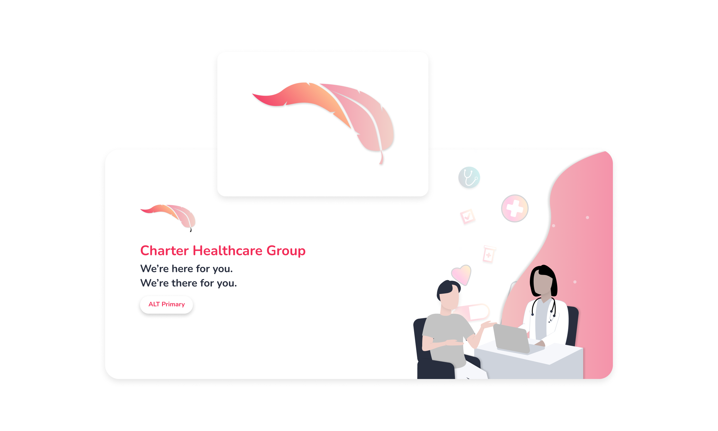
Some variants also existed with very non-coherent design/branding choices, some with odd color choices that have no cohesive purpose with the rest of the branding. Existing design assets were scattered and sometimes non-existence, with there being no real knowledge across the company of when/where/by whom these assets were created.

Starting with the data
With little to work with, I decided it’d be best to start gathering a broad set of data:
- How do we feel about the existing logo?
- Who are we as a company in our own eyes?
- Who are we in the eyes of our partners and communities?

I learned a lot!
- No one likes the brown palette
- Many love the pink accent colors
- No one likes the current typography choices, they feel dated and unreadable
- We put compassion first
- Our patients see us as a hand to hold during difficult times
- Our partners trust us and see us as dependable
- With that trust and reputation, our existing logo has good recognition in the communities we serve
With a new and improved understanding of our brand and design preferences, I threw together 20+ first drafts. To start, I tried to focus on refreshing what existed. The VP of Marketing and I found this to be creatively limiting, and further surveys showed subpar reception to these iterations.

We grew bolder in our experimentation.
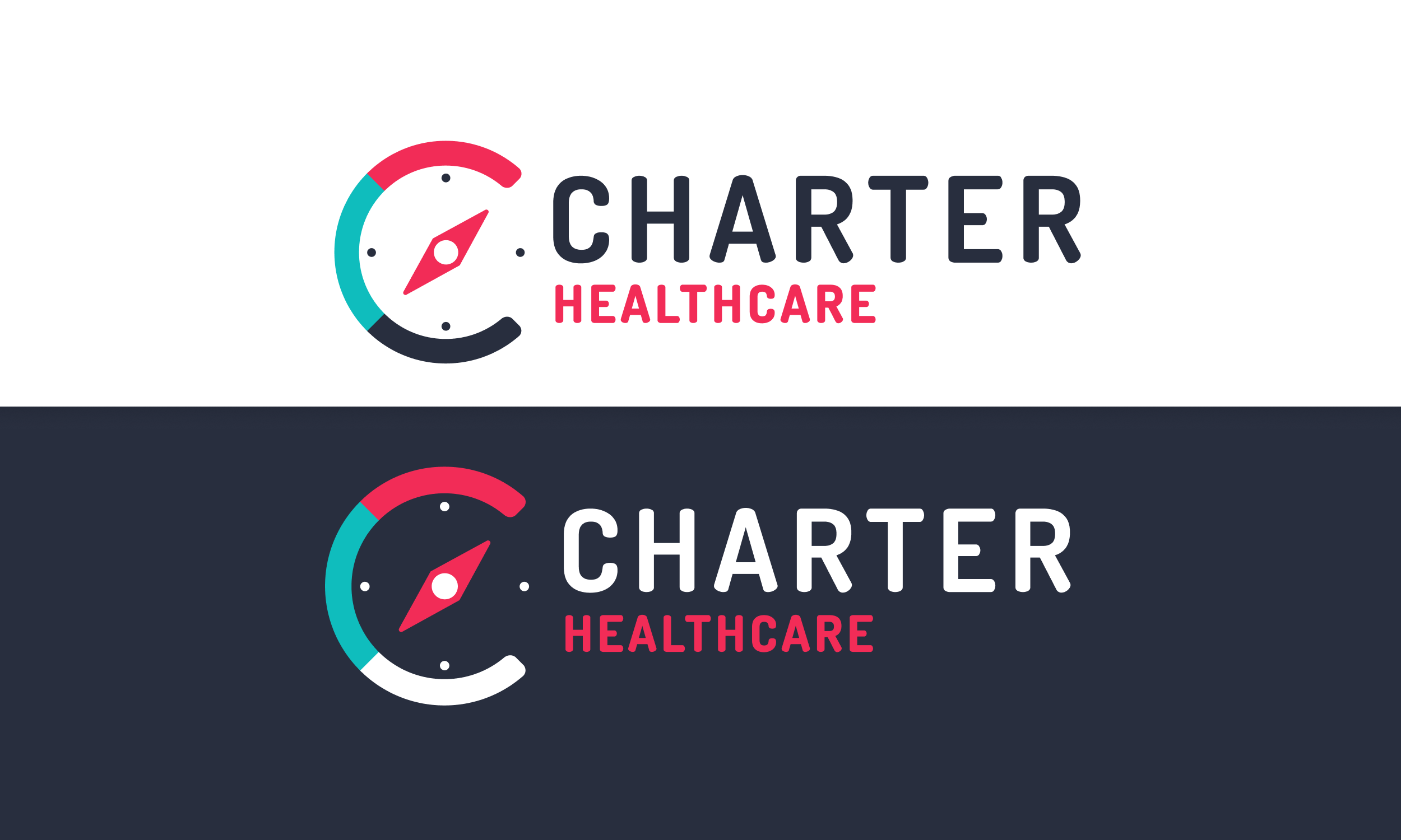
- Came up with the Charter Compass as a symbol that better embodies our mission
- Deepened the pink to make it more accessible
- Swapped out browns for blue shades to hearken to common healthcare branding
- Chose new typography for modernity, readability, and brand embodiment

The symbolism, design choices, and direction all excited the various stakeholders, from the Executive team to the Marketing team. Marketing began to work with HR, Legal, and more to plan out the new logo roll-out. In the meantime, I was ready to expand upon these design choices to create a design language and system.
Check out this project on UNIFY Design System to learn more about Phase 2!


