


Color Palette Parity @ Color Health
Aligning system color palettes in design x code
✍🏽 About Color
Color Health is a Series E biotech unicorn building a public health software platform.
Color offers healthcare services like testing, vaccines, and medication for COVID, at-home screening for biometrics, and STIs, all made seamless with web applications and portals.
In 2022 they partnered with 2,000 organizations, including public health departments, universities, and employers across the US.
⚠️ The Problems
- Material UI comes with a theme out of the box, and that theme comes with a default color palette.
- Color's home-grown design system has its own color palette structure, organizing colors in a completely different way from the Material UI palette.
- When a designer hands off a mock-up to engineers for implementation there's a good chance the theme in code won't have the colors used available.
- Engineers often have to bypass the theme palette to get the colors they need, which is necessary but ends up diluting the power of shared components and good theming architecture.
✨ The Solution
- Take advantage of a fix-it sprint and jump in to clean up the theme color palette in code using Typescript module augmentation, careful planning, and a lot of cross-functional collaboration.
👯♂️ The Team
- 1 Senior EM
- 2 Design Systems Product Designers
- 3 Software Engineers
- Design Technologist (Me 👋🏽)
📝 Phase 1: Learn Stuff
I started by working to understand the current setup of our color palette implementation in the code. I knew a lot about it from working with our themes all year, but this was a real deep dive.
And to document my findings - who doesn’t love a Figjam diagram?
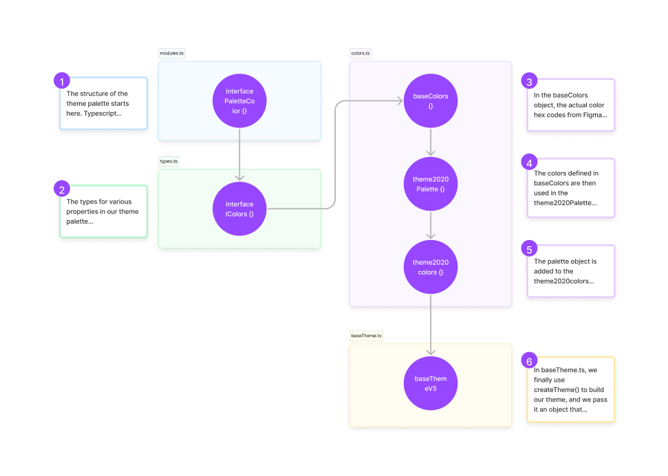
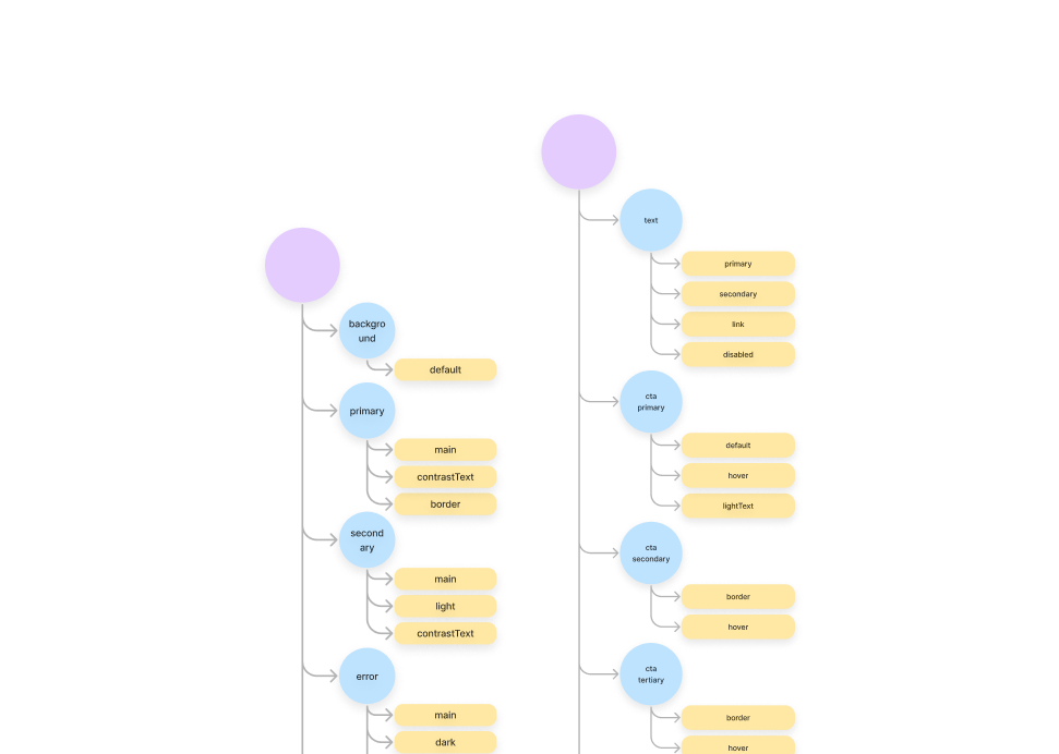
With a better understanding of the code, I wanted to map every color value in our theme and compare it to every color value in our design system tokens.
This visual created a super noticeable diff at a glance and helped me identify exactly which values were out of sync.
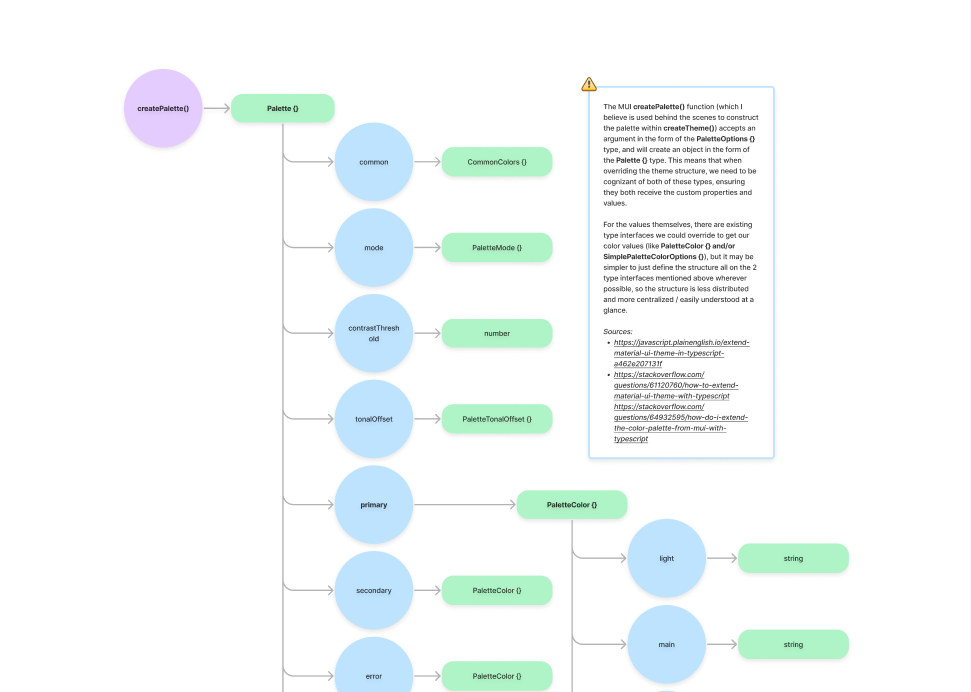
The last piece - what does MUI’s Palette object look like out of the box?
I documented the structure of the default MUI color Palette types here next. This helped me see the delta from what we need vs. what we get from MUI by default.
🧠 Phase 2: Plan The Fix
Time to plan out the implementation! I came up with 2 options after some deliberation:
- Solution A: add on missing properties to the existing palette from MUI and adjust individual types as needed
- Solution B: ignore all default palette properties, add the entire design system palette under 1 custom field to avoid overriding all the existing types
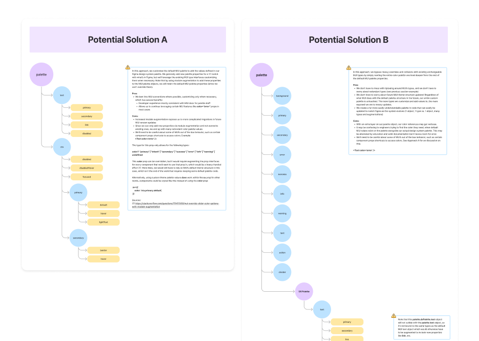
We ended up deciding on Solution A to minimize customization, preventing as much future migration pain as possible should the MUI API change (which it has definitely done). Of course, things at scale are always more complicated than they may seem. For us here, we had to consider other questions like:
- How can we continue to ensure design system flexibility and how can we make bug discovery and remediation easier?
To address these constraints, we opted for some finishing touches in our solution:
- Make all palette values required: if all values in the palette are required, all teams need to be specify a token for each value. Some themes didn't have tokens for all values though, which leads us to item 2 -->
- Utilize an unusedColorValue token: for themes that don't need certain values, they can stick this value in its place. It defaults to an error red color, so if components eventually end up using values that certain themes don't specify, it should provide a glaringly obvious sign to the teams that the designers should assign a value for that field.
🚀 Phase 3: Ship it!
I dove in and touched up the theme code and add in the missing color token values. I listed engineers from every product team as well as our UX Infra team for review. Great conversations / comments ensued. Some tokens could be easier to just change in Figma vs. code. I worked with the Design Systems designers to identify some color names to change - i.e. - ‘error.main’ vs ‘error.default’
I moved on to getting any breaking CI tests (unit tests, integration tests, etc.) passing. Lots of incorrect or unexpected color implementations cropped up! I converted it from a draft PR to a normal PR, listed final reviewers, and...
✅ MERGED!
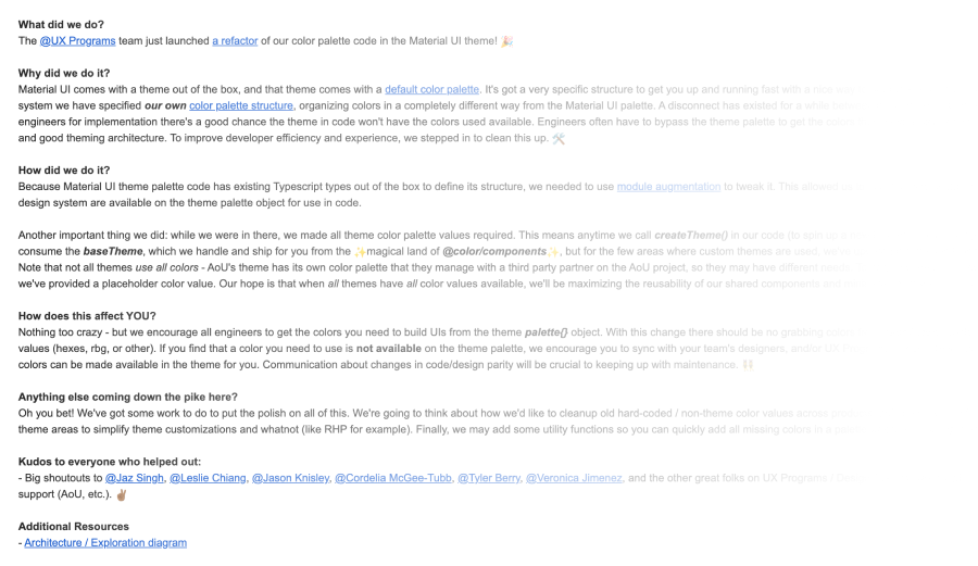
Overcommunicating
I sent out a product/eng/design-wide “Invisible Changes” email to notify all product teams about this change. I encouraged them to...
- Be on the lookout for UI regressions!
- Contact our team any time in the appropriate channels
- Leverage the theme color palette ONLY for all future UI development.
Some of the pieces of product team UIs turned red out of nowhere! This was proof our unusedColorValue token was working to uncover incorrect theme color usage! I made fixes for teams and worked with their teams to merge them in.
🚀 Impact
🧠 Learnings
- Cross-functional collaboration with product teams
- Architecting scalable solutions to large, complex problems in code
- Bridging gaps between Design and Engineering
- Taking initiative and seeing something through from conception to implementation
- Best practices with application UI theming, design tokens, etc.
📝 Limitations
- Utilities needed to quickly declare all color palette values on a new theme instance (vs. manually adding unusedColorValue tokens where colors weren’t needed/didn’t exist)
- Components and UIs still needed to be migrated from any hard coding / manual color usage to centralize all components into consuming theme colors only
This project was well received across orgs and I got some really kind feedback on this project during the peer review cycle we had just a month or so later. Here's some great quotes from colleagues who appreciated this effort:
"Branon recently decided that Color’s color tokens were desperately in need of
a revamp. He brought me in as a design partner early on, and we talked through
a couple approaches. Once we aligned on a direction, Branon was able to
implement that direction in a way that not only improved our current state,
but made it possible for the system to grow and adapt more easily in the
future. During this effort, he absolutely brought his hard skills to bear, but
I was more impressed with his ability to explain why the work was valuable and
how he was approaching the work to a variety of audiences. It is RARE that an
engineer can explain something like this in a way that folks who don’t touch
code can walk away feeling like they understand it, and it’s a testament to
his own understanding that he was able to do that."
- Staff Product Designer, Design Systems
"I appreciate the engineering work that Branon did to standardize and update
the code across the Color platforms, which also required learning and
documenting some of the engineering bootstrapping for those projects. Branon
goes above and beyond to help others, and his effort really made everyone's
lives easier. I also appreciate Branon's ability to take on complex work in
the React codebase, and to ask for help when needed, along with taking that
feedback well."
- Staff Software Engineer, UX Infrastructure
If you made it this far - thanks for listening, I hope you enjoyed the project!