


Loading Screen Revamp @ Smartsheet
Revamping the loading/splash screen for the entire Smartsheet platform!
✍🏽 About Smartsheet
Smartsheet is an industry-leading enterprise work management platform, boasting millions of passionate users!
The same project data can be dynamically viewed in various different ways (card/boards, timelines/gantt charts, and tables/grids). Content/asset management, workflows, mini-apps, dashboards, and more make for a robust CWM ecosystem capable of servicing large enterprise customers and small nimble customers alike.
⚠️ The Problem
Every time a user opens the Smartsheet app, they're greeted by a loading screen - a splash screen that covers the viewport while the application boots up under the hood. It's one of the very first things a user sees, and it sets the tone for the entire experience. As a design engineer, it was the EXACT type of thing I have on my radar - fixing it would inject a moment of beauty and modernity into the very first moment a user enters the platform, i.e. a HUGE UX boost. When the opportunity popped up to do just that, I jumped in to own it.
The existing loading screen was functional, but it wasn't doing the brand any favors. Here's what users were seeing:
- A flat, boring background - a generic solid navy blue. On-brand, sure, but really, really boring. No gradient, no depth, no personality.
- A dated loading animation - the Smartsheet logo simply flashed in with no entrance choreography, and a plain white line slid back and forth beneath it to indicate loading. There was no container bar around it - just an ambiguous white line moving side to side. It felt unpolished and vague.
- Jarring text messaging - after certain amounts of time, messages would appear to let users know loading was happening, and eventually to surface a "get help" link for troubleshooting. But the text would flash in instantly with no fade or transition, which felt abrupt and cheap.
- A flash of empty screen - the loading screen was actually timed to disappear before the app was fully ready, leaving a split-second flash of an empty white screen between the loader exiting and the page content rendering. This happened because our app loads across a couple of different bootstrap systems, and they weren't coordinating their timing properly. More on that later.
✨ The Solution
Design and build a brand-new loading screen animation from scratch - one that feels polished, communicates progress, and gracefully handles slow load times more pleasantly - all in a performant clean implementation. Working with a motion designer on my team, we came up with some specs for the new loader:
- Feature a sequenced brand reveal animation with the Smartsheet logo and wordmark, hearkening to existing brand motion designs
- Include a reimagined loading bar that feels alive and intentional
- More tastefully surface helpful messaging on long loads
- Exit smoothly with a fade-out transition once the app is truly ready
💭 Phase 1: The Animation Sequence
The core of this project was choreographing a multi-stage CSS animation sequence. I started by breaking the loading screen into distinct visual phases, each timed and eased with intention based on what we came up with for the new animation:
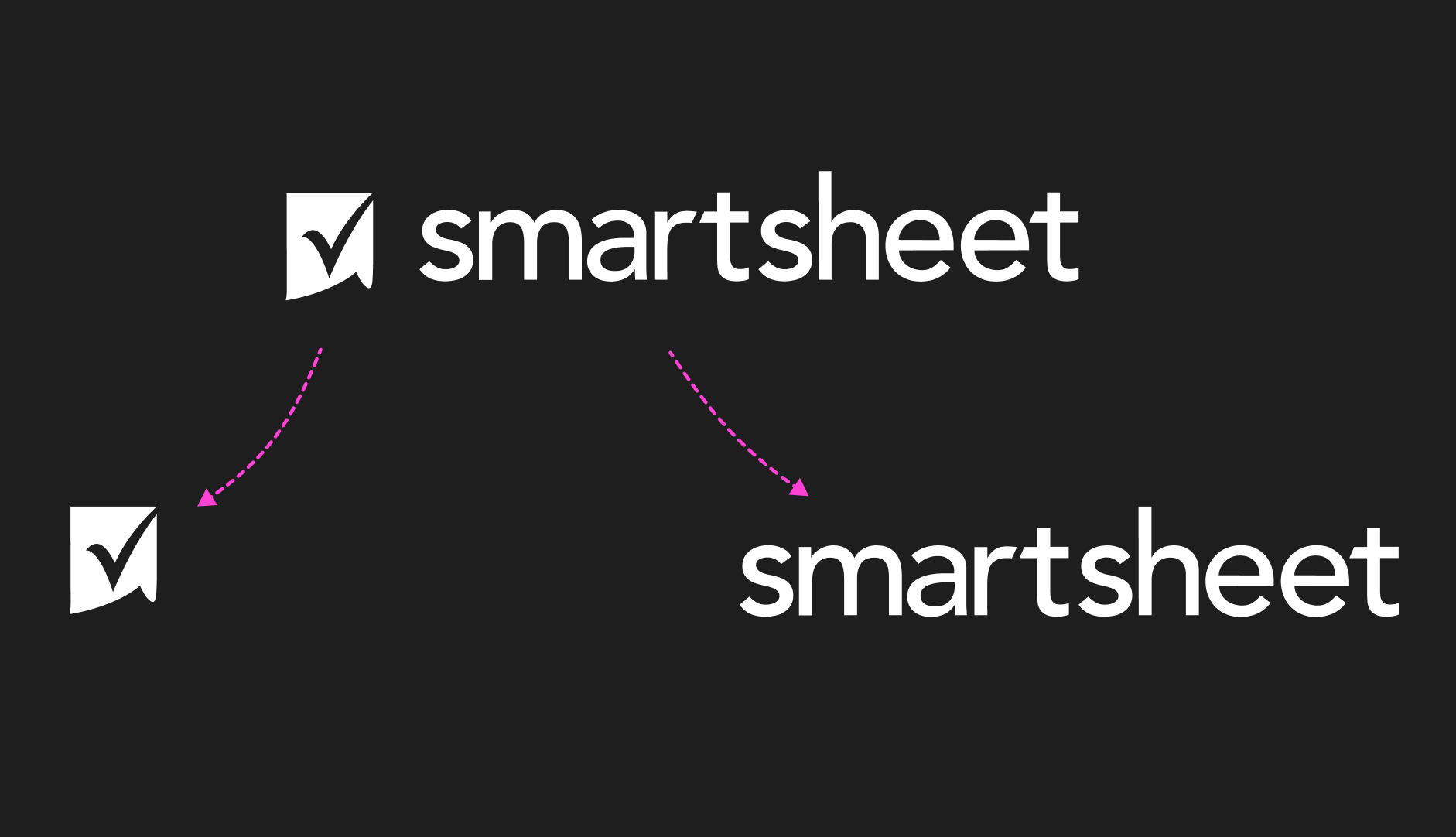
Logo Reveal
The first step was splitting the Smartsheet logo into two separate assets (easy thanks to Figma + existing brand assets!) - the checkmark symbol and the wordmark - so they could be animated independently.
The checkmark fades in at the center of the screen, then slides left to make room for the wordmark. This uses a custom keyframe animation with two phases - a fade-in followed by a horizontal slide - driven by a custom easing curve for a snappy, confident entrance.
Wordmark Slide-In
For the wordmark reveal, my initial approach was to use a CSS clip-path: polygon() animation - defining a shape that starts fully clipped and expands to reveal the wordmark from left to right.
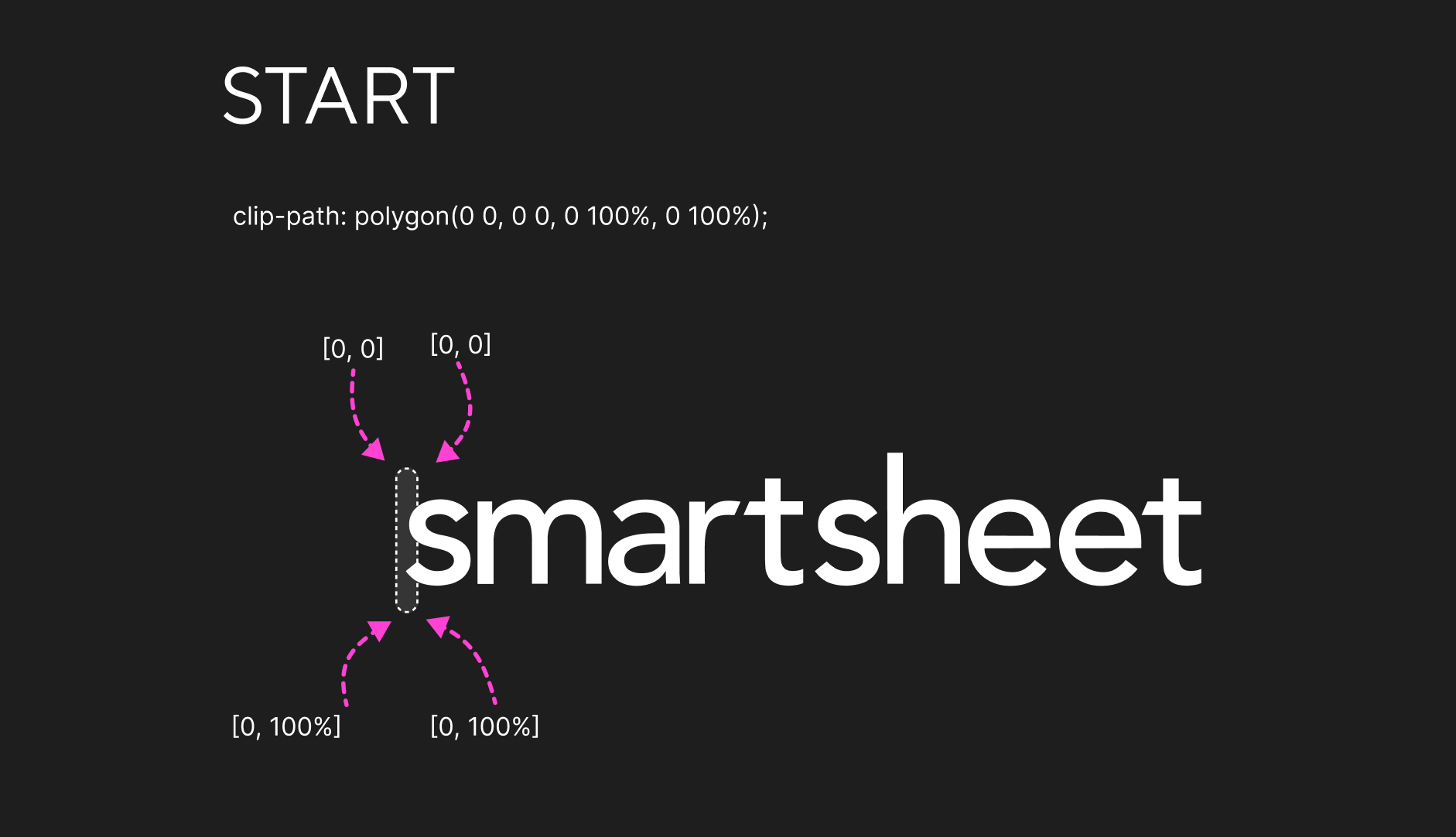
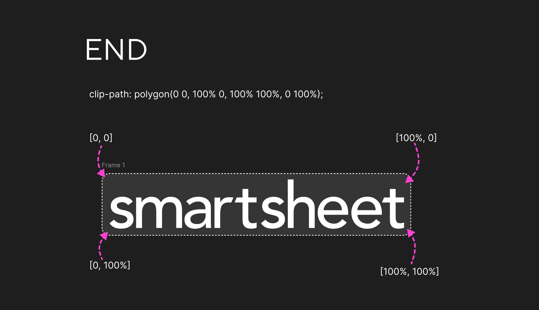
This looked great in our Codepen where I prototyped the new screen, but when I shipped the first iteration of the new loading screen to the actual app environment, the animation flickered badly. We eventually optimized this, but not yet - keep reading on :)
Loading Bar
After the brand reveal completes, an indeterminate loading bar fades in beneath the logo. It's built with two overlapping animated bars (bar-1 and bar-2) that scale and translate across the track on staggered infinite loops, creating an organic, flowing motion that feels fluid and dynamic.
🔧 Phase 2: Performance Optimizations
Getting the animation to look right was only half the battle - getting it to run smoothly inside a massive enterprise application with decades of accumulated complexity was the REAL challenge. Some issues of note:
Replacing Layout-Triggering Properties with Transforms
So how'd we fix the nasty flickering in our first pass at this animation? After some sleuthing I found a culprit: the browser's rendering pipeline handles clip-path by triggering a repaint on every frame, because the browser has to recalculate which pixels are visible within the clipped region. The element's layer has to be re-rasterized constantly throughout the animation!
Also, during Smartsheet's bootstrap phase, the main thread is under heavy load - parsing and executing massive JavaScript bundles, hydrating the DOM, etc. Since browser paint operations run on the main thread (CPU), they're directly competing with all that JavaScript execution for processing time. The result: nasty dropped frames and flickering. 😵
Initially, I tried adding will-change: clip-path to prevent the flickering, but that only helps the browser avoid repainting other elements - the clip-path element itself still needs to be repainted on every frame. So the flickering persisted.
Eventually I found a fix: abandon clip-path entirely and use a much more performant technique, an overflow: hidden container with transform: translateX() animations. Both the container and the inner img start translated off in opposite directions, and a shared slide-reveal animation brings them both to translateX(0) simultaneously, creating the same satisfying wipe-in effect. The beauty of this solution is that the transform property is rendered by the GPU - freeing up the CPU to continue worrying about all that heavy javascript. 🤓
Summary: The browser's rendering pipeline has four stages: Style,
Layout, Paint, and Composite. Properties like top and left
trigger the full pipeline starting from Layout. Properties like transform
and opacity skip straight to Composite, which runs on a separate thread via
the GPU - making them dramatically cheaper to animate, especially when the CPU
is under heavy load.
This iteration performed exactly as we'd hoped it would in our production environment (behind a flag of course!): buttery smooth with no flickering, even during the heaviest load times. 🧈
🕐 Phase 3: Handling the Long Wait
One of the most important UX considerations was what happens when loading takes a long time. We didn't want users to feel abandoned. We had some text already popping in at various times, but it felt like an afterthought. So we kept it simple and polished what existed.
Standby Messaging
We sped up the time at which the first message appears: after 10 seconds of loading, "Please stand by while Smartsheet is loading." fades in tastefully. This is subtle but reassuring - it lets the user know the app is still working and they haven't been forgotten.
Get Help Messaging
We sped up the appearance of the final message as well: at around 20 seconds, the standby message fades out and is replaced with a more actionable message suggesting the user refresh their browser, along with a link to Smartsheet's help resources. This two-tier messaging system ensures users are never left in the dark.
Between subtle fadein/out animations & quicker message appearances, we felt better about the modernity of the experience and how it met users experiencing issues or slow network speeds.
⚙️ Phase 4: The Exit & Integration
Cross-System Coordination
One interesting challenge was that Smartsheet's UI code isn't loaded by a single bootstrapper - it's split across separate systems. Part A handles the initial application bootstrap (loading scripts, initializing state, etc.), while Part B handles rendering the actual product interface. These two systems load independently, and the loading screen needed to be savvy to the entire loading process across both.
The problem: Part A kicks off the loading screen animation when it starts loading stuff, but it's Part B that knows when the app is actually ready to be shown. How do you coordinate the exit of an animation across two independent systems that don't directly communicate?
The solution was using a Promise attached to the window object as a shared contract between the two systems:
// --- PART A --- //
// Starts the animation and sets a minimum animation time promise
window.minLoadingAnimationDonePromise = new Promise((resolve) => {
  setTimeout(resolve, 1800);
});

// --- PART B --- //
// When Part B loads, it checks for the promise and waits for it before exiting
if (window.minLoadingAnimationDonePromise) {
  window.minLoadingAnimationDonePromise.then(function () {
    loadingScreen.classList.add("fade-loading-screen-out");
  });
}
Part A creates the Promise and attaches it to window, guaranteeing that the minimum animation time (1800ms) will elapse. When Part B finishes loading and is ready to show the UI, it looks for that promise on window. If it finds it, it .then()s on it and triggers the exit animation only once the promise has resolved. This way, even if Part B loads lightning fast, the brand reveal animation still completes before the screen fades out.
There's also a defensive fallback: if the promise doesn't exist for some reason (perhaps Part A failed or loaded in an unexpected order), Part B immediately triggers the exit animation rather than leaving the user stuck on an infinite loading screen. Sacrificing a smooth animation is always preferable to a broken experience.
Graceful Fade-Out
The exit animation is a two-step sequence: the entire loading screen fades to opacity: 0, and then its z-index is dropped below the app content. This avoids any hard cuts or jarring transitions. A will-change: opacity hint is applied to the container to ensure the browser optimizes the compositing for a buttery-smooth fade. Initially, we had a full-page swipe-out animation but it felt heavy-handed and then required us to add a prefers-motion: reduce media query to disable it for users with motion sensitivities, so we opted for a simple fade instead that still felt polished but was more universally accessible.
🚀 Outcomes
Shipped to Millions
After an internal release and then a public GA, this loading screen shipped across the entire Smartsheet platform, becoming the very first thing millions of users see when they open the app. 💫 It replaced the old antiquated loader with something that exudes UX craftsmanship. Our CEO Mark Mader personally applauded us for this ship, calling it out as an awesome example of upping the quality bar at Smartsheet! Check out our release notes on this fun change!
Pure CSS + Vanilla JS
The entire animation system is built with pure CSS keyframe animations and vanilla JavaScript - no animation libraries, no framework dependencies. This keeps the loading screen ultra-lightweight, which is critical since it needs to render before the main application bundle even loads.
Document!!
This was a complex animation with a lot of moving parts and performance gotchas, so I made sure to document the implementation details, the rationale behind technical decisions, and the lessons learned along the way. This way, future engineers can understand the "why" behind the code and maintain or iterate on it with confidence.
Also, opening some of the old loader code showed git blame notes 13+ years old, written when I was blissfully in high school 😂 Having modern docs in a central team-aware location ensured the next time folks update this code, everything is mapped out. Hopefully it's not another 13 years!
🧠 Learnings
- Choreographing multi-stage CSS animations with precise timing, easing curves, without fancy libraries
- Writing performant, scalable UI animations in highly scaled enterprise app environments
- Understanding the browser's crazy rendering pipeline mechanics!
- Unpacking complex and old system architectures and learning to work quickly amidst complex technical constraints
- Driving results on a large user-facing project end to end, from design -> prototyping -> implementation -> optimization -> release!
- Crusading for quality :)
Thanks for tuning in! Cheers.