
Reimagining GitHub 💭 @ GitHub
Rethinking the GitHub experience from the ground up.
✍🏽 About GitHub
GitHub is the world's largest developer platform, home to over 100 million developers and the source code that powers modern software. You might already know that though :)
✨ Design Hackathon 2025!
- Having just joined GitHub 1-2 months prior to our hackweek, I was fresh in the onboarding phase. I had thus spent TONS of time diving into the deepest depths of the platform that I'd never explored as a user over the years.
- A crew was assembling with a goal that immediately caught my eye:
reimagining GitHubfrom the ground up.
Teaming up with my colleagues Lukas Oppermann, Natalie Harris, and Grace Farrell, we thus set out to rethink GitHub, in an open-ended way, and compile our different approaches to that prompt as a unified hackweek crew.
This is all about where my brain took the challenge! I focused on two design concepts in GitHub: navigation patterns & layouts.
🧭 Navigation
The first surface I tackled was navigation — the connective tissue of the entire product. The goal: simplify the IA without losing anything power users rely on.
As a guy who very recently spent a lot of time exploring GitHub, I found myself significantly confused on how to get places! We had redundant link options across the top bar, the left global nav, the tabs on a given page, and the top right user menu.
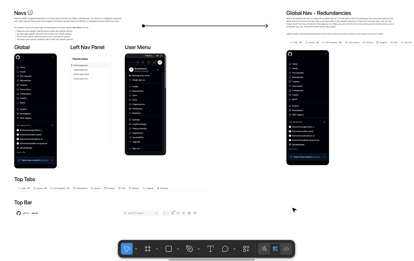
My main solution: remove redundancies in the global left nav by moving some items to the user menu, and simplify page breadcrumbs & tabs.
I also wanted to modernize our UI a bit with some more contemporary design language changes, such as rounded border radii on more modular component containers. I also made the navbar collapsible while still letting it live in the viewport at all times. We were after all, imagining :)
I prototyped up these concepts the old fashioned way in Figma - quick and dirty for the sake of time during hackweek.
In moving some nav items to the user menu (things like repos, etc. felt reasonably user-related since it takes you to a page with all your user's repos for example), I accidentally created a scalability issue for that user menu. It was getting really long.
I decided to have fun and try a mega menu approach to group the menu options for easier readability, tying in my new modular container design. To me, this felt superior to the current user menu with a lower cognitive load in visually scanning for the menu items I'm looking for.
With these simple (but experientially huge) changes to navigation, the resultant page sported a slightly more hierarchical and sensical information architecture. Nice!
📏 Layout
With nav in place, I turned to the broader page architecture — how content, context, and actions coexist on the screen.
One interesting thing to me about most views on GitHub is the amount of empty space on the page. Content sections for PRs, alerts, issues, and more often sport a thread/blog-style content section with a side panel that is not collapsible. In the modern age of responsive, flexible information-dense productivity tools, this can feel a bit dated and perhaps less resourcesful with spacing.
I began to play with a bold idea: what if we applied common productivity application layout patterns to GitHub?
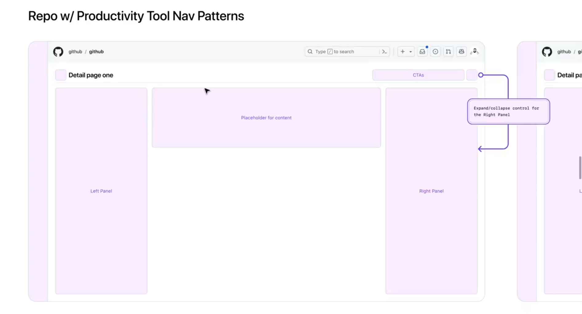
A new layout took shape in my mind, in which a page has its top bar and navigation in its outer shell, and the inner content is populated more full-width, with a header, a content area, and left and right panel slots.
In the header, left and right button slots can be used across views to keep toggle buttons that may control the right and left panels. This allows for collapsible panels that saves real estate on the screen for the nitty gritty work in code reviews, issue and discussion comment threads, long timelines, critical alert information, and more!
Now we're having some fun! I mocked up a flow in this layout to bring it to life, prototyping a repository page into a pull request experience. Shoutout to Primer for being my lab rat!
🔁 Pull Requests
On a pull request page, our new productivity tool layout shines! Like the repo page panel, the right panel here can be expanded and collapsed at will, giving more room to focus and hide the noise.
If you navigate to the Changes tab, where engineers of course spend most of their time reviewing PR changes, the left file tree panel then fits into our new layout paradigm and can be expanded and contracted as well.
The result is a more dynamic surface where panels can come and go as needed, creating a clarified UX for tasks that are already very mentally demanding.
🚀 Outcomes
🏆 Our crew snagged the Merge Award from the judges (our VP, Director, CPO, and more!) for innovation in pushing the boundaries of what's possible with design at GitHub! My contributions on navigation and layout, paired with my incredible teammates' work that isn't covered here, came together into a unified vision that earned us the win.
That said, some future implications/callouts:
- Deeper exploration of the navigation concepts. Hackweek is a sprint, so a lot of these ideas were instinct-driven. I'd love to pressure-test them with broader user research to validate which patterns hold up long-term and which need rethinking.
- Specing this out with motion. A lot of what makes a layout feel modern is how panels expand, collapse, and transition. I'd love to fully spec the motion language for these changes to really modernize the experience end-to-end.
🪞 Reflections
It was a career high to join a company I've always revered, dive into a hackweek with the incredible design talent here in my first couple months, and bag an award for our work! Can't wait for the next one 🚀