Branding & Digital @ TIDAL Acupuncture
A comprehensive brand and website for a modern, SoCal Acupuncture clinic
✍🏽 About TIDAL Acupuncture
Tidal Acupuncture is a fresh new socal-based and socal-inspired wellness clinic in San Diego, CA. Okay, fine, I'll admit it - my wife is a co-founder and that's where I come into the picture for this project 😁 But it's one I'm super proud of so buckle up!
The Project
As my wife and her co-founder made the bold decision to start an acupuncture clinic post-graduation from their doctorate porgram, they were quickly enthralled by visions of something grand - a wellness clinic focused on eastern medicine practice with western medicine awareness, under the guise of modernity and unique character. They wanted to create an approachable, relatable brand to more easily bring eastern medicine healing to those who need it, but may not understand it. As any good husband would, I put my skills to the test to come up with a brand that embodies their vision!
🎨 Branding Redesign
Both cofounders are huge beach gals. They wanted 'TIDAL' to be inspired by the beauty and tranquility of the southern California coast. A great starting place was the color palette, which was a piece of cake given the beach-like ambitions.
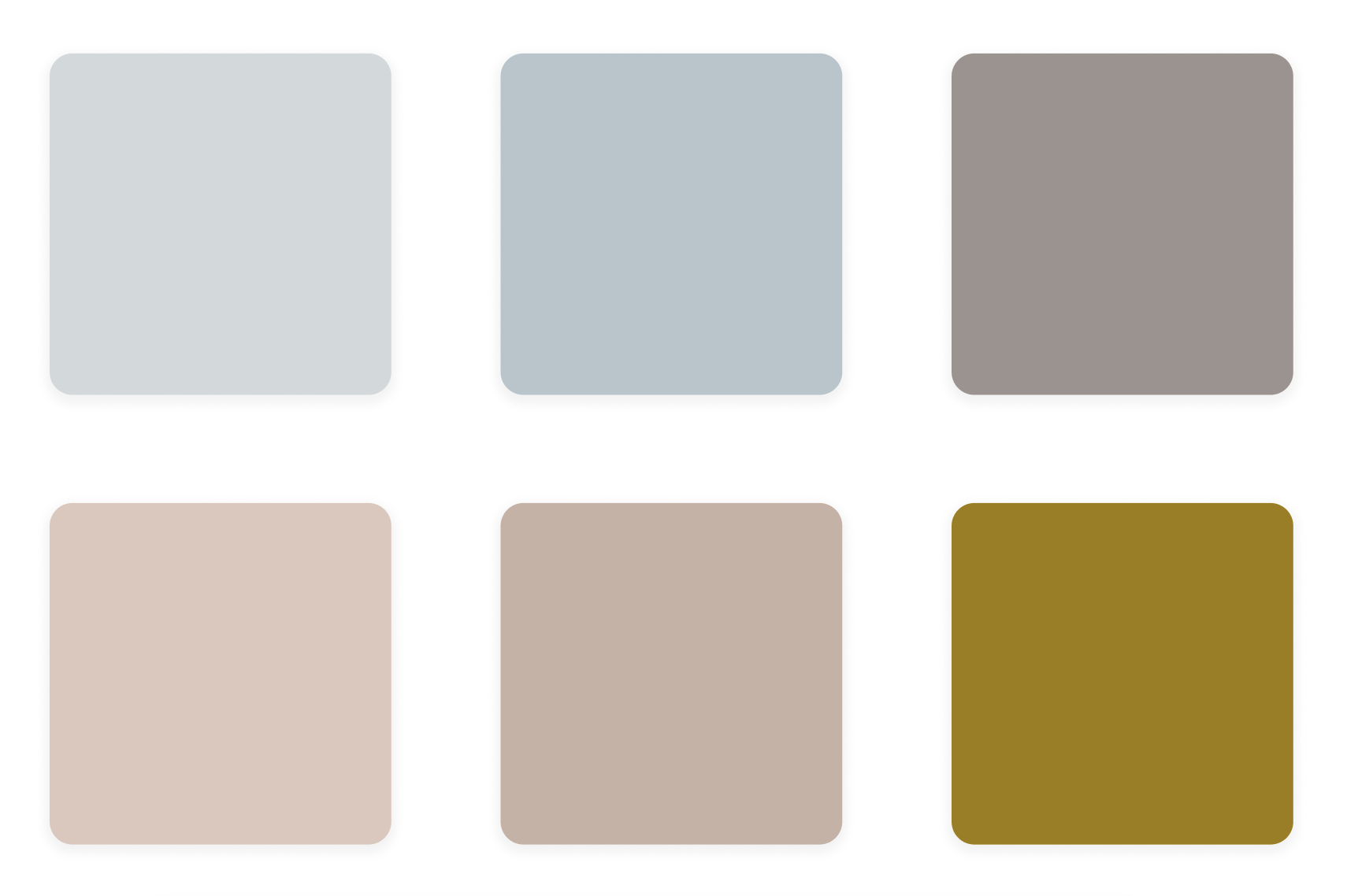
I came up with these colors derived from waves, sky, sand, earth, etc. Eventually, I even pushed the boundaries for accentry, incorporating a vibrant 'Mint' blue/green and 'Gold' yellow, paying homage to a more vintage Californian feel in a modern way. More on that to come :)
The TIDAL Logo
Next up was the TIDAL logo! To play on the 'tides', and I made a bold creative decision to design a dark and light mode logo that feature the moon and sun respectively, as a play on not only modern UI system settings, but also the sun and moon cycles that dictate the tides.
Some choices here:
- The main symbol of the logo is the sun or moon rising over the waves, in a minimalist depiction.
- The font face chosen was 'Josefin Sans', which I felt conveyed modernity in the way the founders wanted while still being readable, approachable, and stylish. Like if fashion met wellness.
- I provided lowercase + uppercase options, and the founders liked the boldness and professionalism of the uppercase.
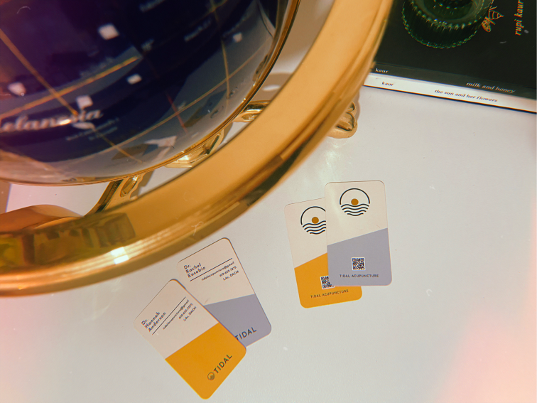
Business Cards
As young professionals starting a business, a fresh, attention-grabbing business card could go a long way. I decided to go big or go home, and went with vertical cards in multiple colorways (6 total), with a cream base and many different accent colors from the palette as a diagonal wave sweeping over the side.
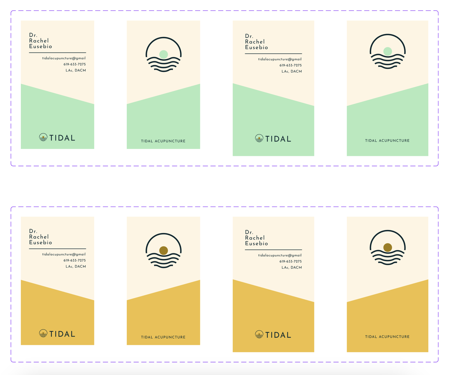
I made sure the essential information was easily scannable and visible of course. Oh - and speaking of 'scannable', we decided to go with a QR code for the website link, which let us cut down on text overload and also increased ease of access, taking users straight to the website with a simple camera scan.
Larger sizes were included for print, where the full-bleed edges accounted for the cutting process. The finished product was BEAUTIFUL! ✨🤩
A custom-coded website
What better way to cement an exciting new brand than to bring it to life in a brand new, custom designed and custom-built website? I got to work in constructing a simple, yet beautiful and usable website for their digital storefront.
This website is a custom React app using NextJS, Chakra UI, etc. hosted on Vercel. It includes a form solution via Formspree.io, Google Analytics for user insights, and much more. I leaned into elements of the color palette that mirror the real appearance of the beach during the day and night (in light and dark mode respectively).
Everything is responsive on all device sizes, and I even added a little flair in light/dark mode by changing certain imagery on certain pages based on the mode.
Time to ride the wave!
I loved working on this project, not just because I got to support my wife's passions, but also because I feel we got to create a brand that expresses character in a highly-differentiating way for this industry.
I'm so excited to see where this venture goes. Check out the live TIDAL Acupuncture website here, and experience this all for yourself :)