UNIFY Design System @ Charter Healthcare
Creating a foundational design system, from 0 to 1!
✍🏽 About Charter Healthcare
Charter Healthcare is a healthcare company devoted to helping patients navigate their post-acute care journey. They’re big in Southern California, providing services like home health, hospice, palliative care, and more.
⚠️ The Problem
With Charter's brand recently revamped, we wanted to cement new branding and design decisions (rooted in our company values and mission), into our new upcoming digital identity/projects.
✨ The Solution
Create a simple, foundational design system with reusable components in Figma and code, documentation and guidelines around usage and design decisions, and a repository of new branded assets, iconography, and more!
👯♂️ The Team
Executive Team
- CEO
- COO
- CFO
Marketing Team
- VP of Brand/Marketing
- Director of Marketing
Technology Team
- VP of Technology
- Creative Lead, Designer, Developer (Me 👋🏽)
🎨 Building UNIFY
Why build a design system?
When I was hired, I knew we had many software projects coming up after our big rebrand campaign. We had grand plans for a new modern corporate website, custom intranet portal, and even physical asset plans like business cards, pamphlets, and more! With all this in mind, I knew we'd want to create a simple design system to translate our new branding and design decisions directly into our user interfaces, experiences, and prints. Benefits include:
- Documentation (for future ICs and cross functional partners)
- Guidelines for creation of physical and digital products
- Parity between design and development efforts
- Developer/Designer Experience
- A reusable component library for R&D efficiency
⚛️ Starting With Atoms
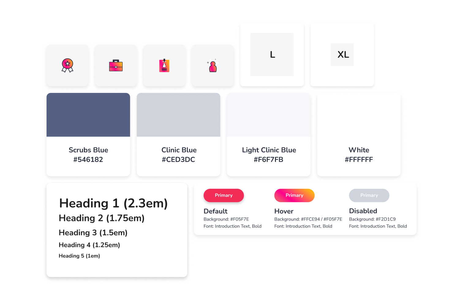
To keep our design system consistent with atomic design principles (shoutout the Brad Frost), I focused on creating our foundations for the system first. Drawing on our brand principles from our rebranding campaign and logo revamp, I:
- Built out typography systems using Google Material Design's typography scale generator with our chosen font faces, and tweaking them visually to get them just right
- Nailed down some basic color primitives based on color scales derived from the logo exercise
- Created basic spacing scales using t-shirt sizes and 8px increments
- Began to create a small library of custom iconography (this was so fun, can't lie)
- Built out simple atomic components, such as buttons with variants for different states, etc.
Building A Documentation Site
Did I mention I was the only designer and developer working on this whole thing? Well, I was, and because of that, I definitely had to take some shortcuts at times... When the time came to begin building out some molecules / more complex components that we'd need for our various upcoming projects, I decided to get clever and build out our React app documentation website first, which would allow me to kill two birds with one stone (or, feed two birds with one scone as a colleague once said):
- Begin drafting documentation around what exists in the system so far
- Begin creating some of the very molecules that could be reused elsewhere (like navbars and other things).
We also had a growing need to share out some of the basic design/rebranding decisions made, and centralizing resources, so it was time to build a docs site! I researched docs solutions and ended up settling on the React/GatsbyJS static site generator framework, which provides a super easy configuration for blog-like websites like our docsite. The result was a beautiful website that had design guidance, code snippets, and more for some of our system's most foundational pieces!
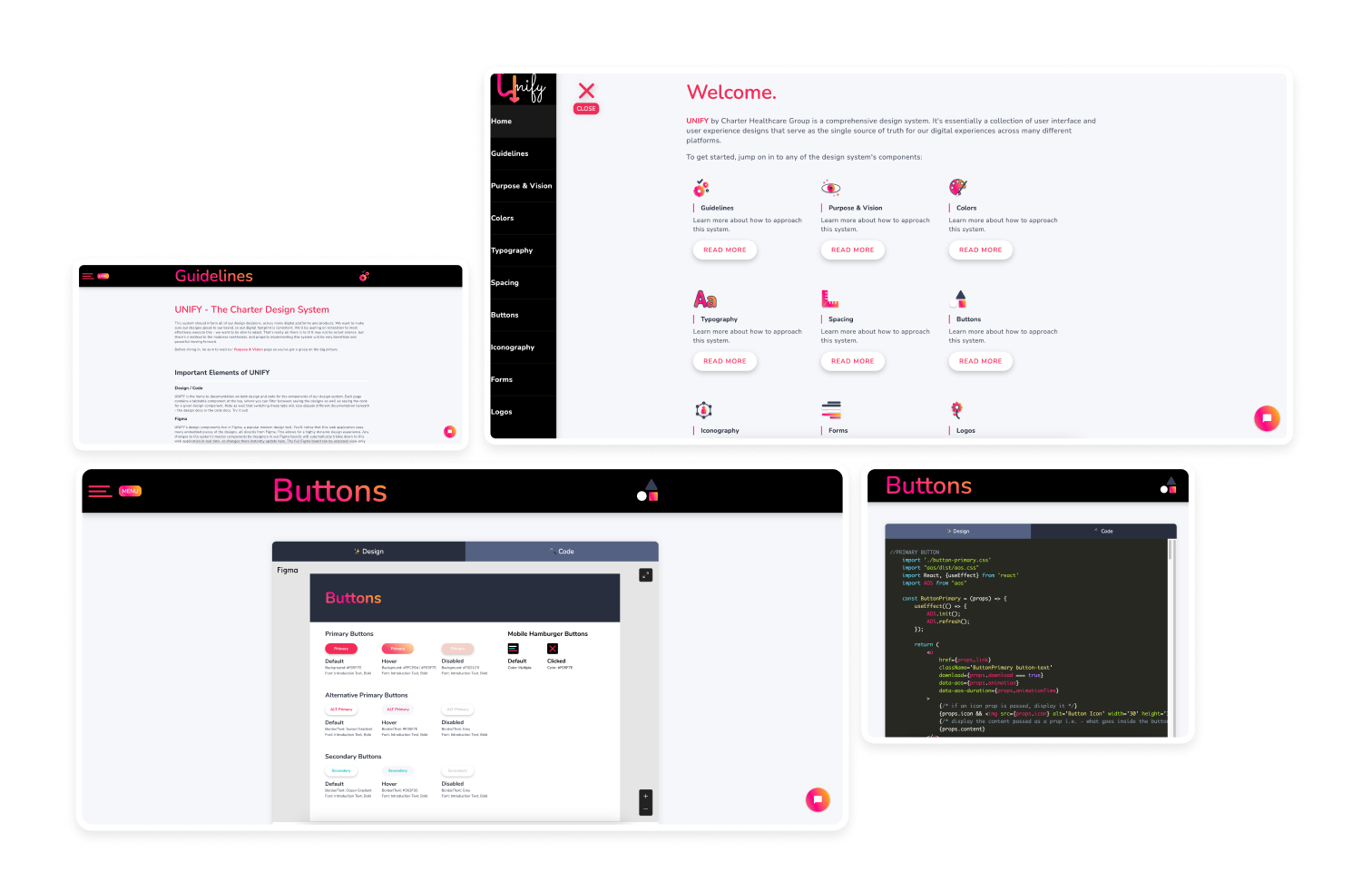
I even included a pre-programmed chatbot that could provide an easy, 'conversational' interface for non-technical stakeholders to find their way to the things they may be looking for! I deployed this site on Netlify to take advantage of the brilliance and ease of static site generation. I setup deployment triggers in Netlify with the mainline branch of the codebase in Github, configured the DNS to point to our new domain, and the site was live!
Molecules & Beyond!
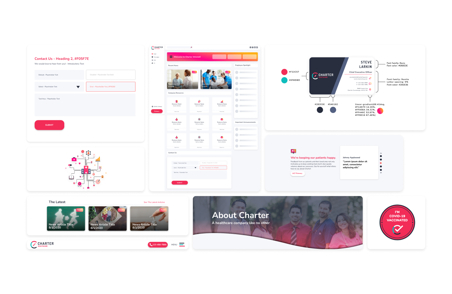
With docs live and some foundations in place, I continued to improve the system with molecules, tweaks, updates, and more. I built out nav menus, contact forms from input fields, published our iconography collection as an NPM package to eventually pull into our upcoming software projects (corporate website + intranet portal app), managing versions with semver, creating react component wrappers for the SVGs, etc.
🚀 Impact
🧠 Learnings
I learned SO much here on the code and design side. On the design side:
- My Figma skills got sharpened by managing variants, autolayout, and more in building our components.
- I learned a ton of fundamental design principles in constructing typography scales, color theory in our palette primitives, and iconography / SVG basics in designing a small icon library.
On the code side:
- I got to sharpen my React skills in creating components from our Figma component library
- Learned about static site generation with frameworks like GatsbyJS
- Setup basic CI/CD for a simple website using integrations between platforms like Netlify, Github, NPM, etc.
- Learned about packaging up NPM modules with our icon package, managing versions with semver, and more.
And I also learned a lot about the limitations here. Our system was small, and in a way its conception was unusual, being born before the consuming projects that may leverage it (potentially creating lots of blind spots). In many ways, keeping it simple was an attempt to not build ourselves into a corner when the real projects roll around.
🔮 Future Implications
All that said, we were finally ready to jump into our long-awaited corporate website rebuild and subsequent intranet portal app project. Post on that coming soon! :)
Cheers, Branon
